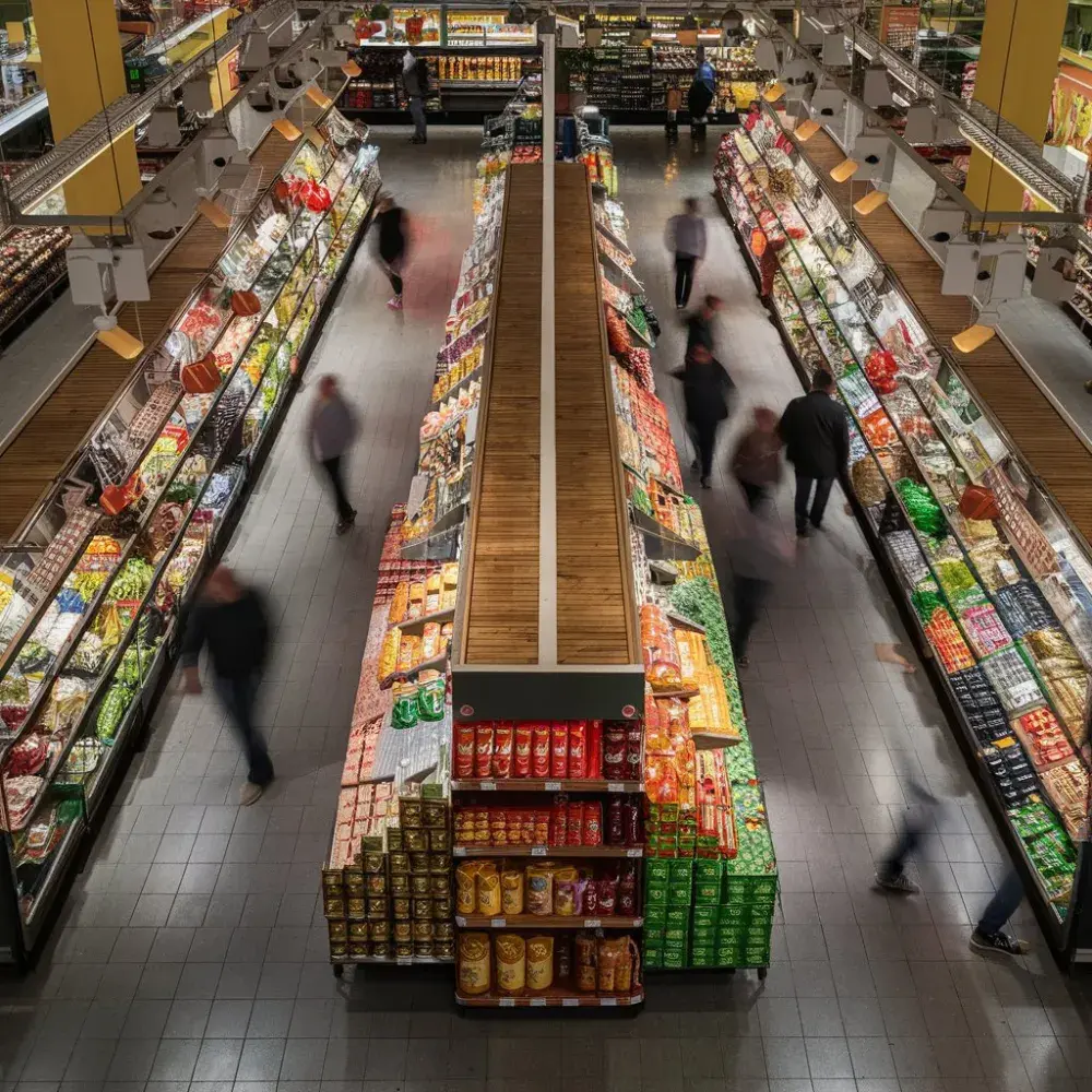
Ever wonder why you end up spending more time and money at the supermarket than you intended? The layout of a supermarket is not a random design choice; it’s a carefully crafted strategy, influenced by shopping psychology. Let’s delve into the secrets behind supermarket layouts and understand the psychology that guides our shopping habits.
Entrance Strategy: First Impressions Matter
As you step into a supermarket, the first section you encounter is often the produce department. Brightly colored fruits and vegetables not only create a welcoming atmosphere but also trigger a health halo effect, making us more inclined to make additional purchases, believing they will be just as healthy.
The Right Turn Predilection
Research indicates that upon entering, most shoppers instinctively turn right. Supermarkets capitalize on this by placing high-demand items or promotional products in this initial right-hand path, encouraging impulse buys from the moment you walk in.
The Strategic Placement of Essentials
Ever noticed how staples like milk and eggs are located at the back of the supermarket? This intentional placement forces shoppers to navigate through various aisles, increasing the likelihood of unplanned purchases along the way. This journey exposes shoppers to an array of products, tempting them with items that weren’t on their original shopping list.
High-Margin Items at Eye Level
Supermarkets place high-margin products at eye level, making them more noticeable and accessible. Meanwhile, less expensive or generic brands are positioned on the lower shelves, requiring shoppers to look harder for these options. This strategic positioning plays on our natural tendency to reach for what’s directly in front of us.
Impulse Buys: The Checkout Line Gauntlet
The checkout area is strategically designed as a last-minute temptation zone. With small, often indulgent items lining the queue, supermarkets capitalize on the psychology of waiting. Shoppers are more likely to make impulsive snack purchases or grab a magazine when they’re queued up and ready to pay.
Atmospheric Influences
Supermarkets also use atmospheric elements like lighting, music, and scent to create a pleasant shopping environment. Soft lighting and slow music can slow down shoppers, encouraging them to spend more time in the store. The scent of freshly baked bread from the in-store bakery can stimulate appetite and lead to additional food purchases.
Navigating the Aisles with Awareness
The layout of a supermarket is a psychological maze, designed to maximize consumer spending. By understanding the strategies at play, shoppers can become more mindful of their purchasing habits, resist impulse buys, and stick to their shopping lists. Next time you visit a supermarket, take a moment to observe these layout strategies and see how they influence your shopping journey.
Learn More
Supermarket Savings: Pro Tips for Maximizing Deals and Discounts
Eco-Friendly Shopping: How Supermarkets Are Leading the Way in Sustainability

